Checkout Redesign
Driving e-Commerce Growth Through Checkout Redesign
Company
Besteller
Role
UX Lead
Date
2020
Context
Bestseller e-commerce is a leading fashion company with a presence in over 12 markets. It offers a comprehensive range of clothing, accessories, and footwear from a portfolio of renowned brands, including JACK & JONES, ONLY, VERO MODA, and SELECTED.
The checkout flow is crucial in e-commerce! It's the last step between a customer's decision to buy and the completion of the purchase. It also boosts revenue, enhances customer satisfaction, and fosters long-term loyalty.
Aware of the existing issues in the checkout flow, we wanted to revisit this journey to address them and identify any potential new ones.
Challenge
Revisit the checkout flow removing friction, and improving metrics such as cart abandonment rate, time to purchase, checkout abandonment rate and the overall conversion rate.
The Approach: Walk in the customer's shoes
Understanding users and their pain points
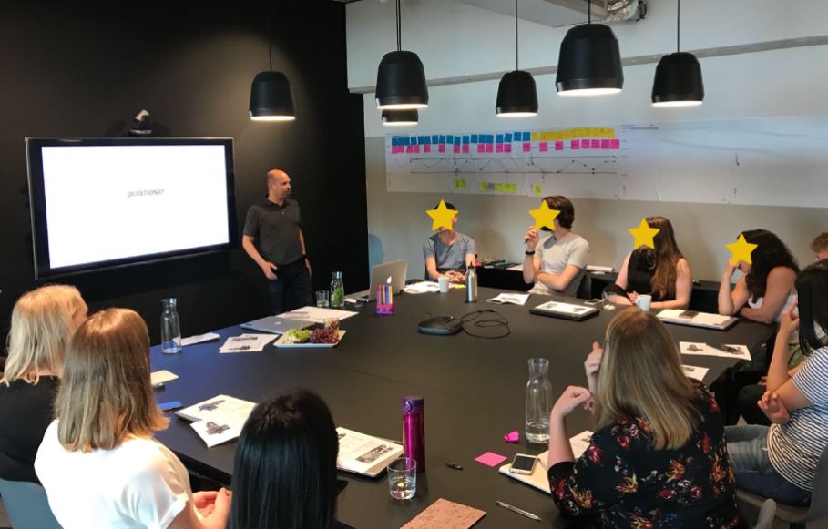
To gain a comprehensive understanding of our users' experiences, we brought together key stakeholders from diverse departments (UX, customer service, marketing, content, engineering and analytics) to run a full-day customer journey map session for our checkout flow. We explored the different scenarios, including the type of customers (new vs. existing), the type of delivery chosen, and the payment method used.
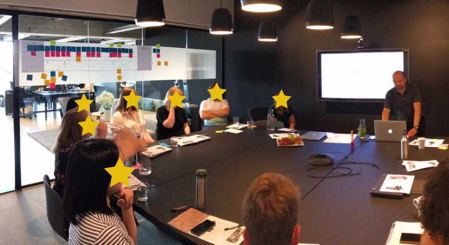
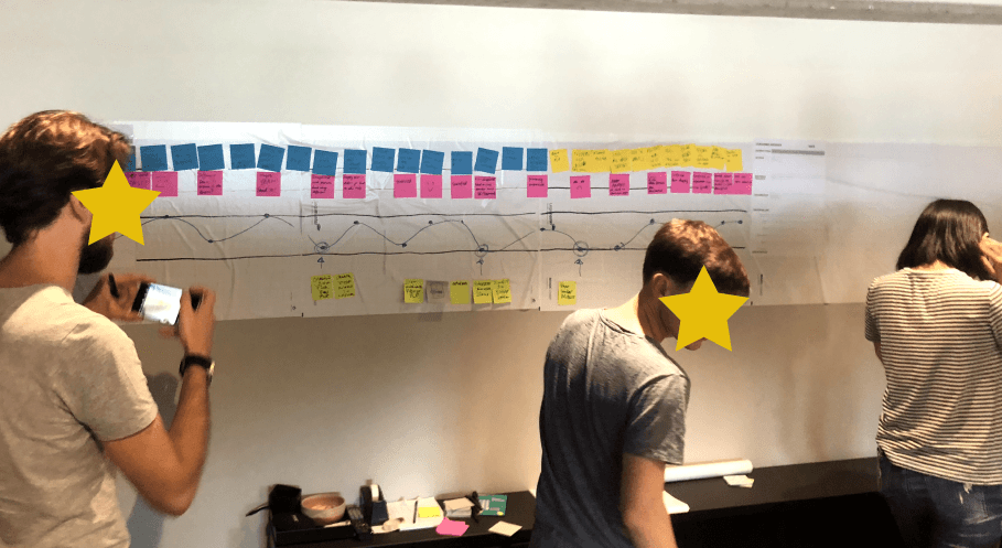
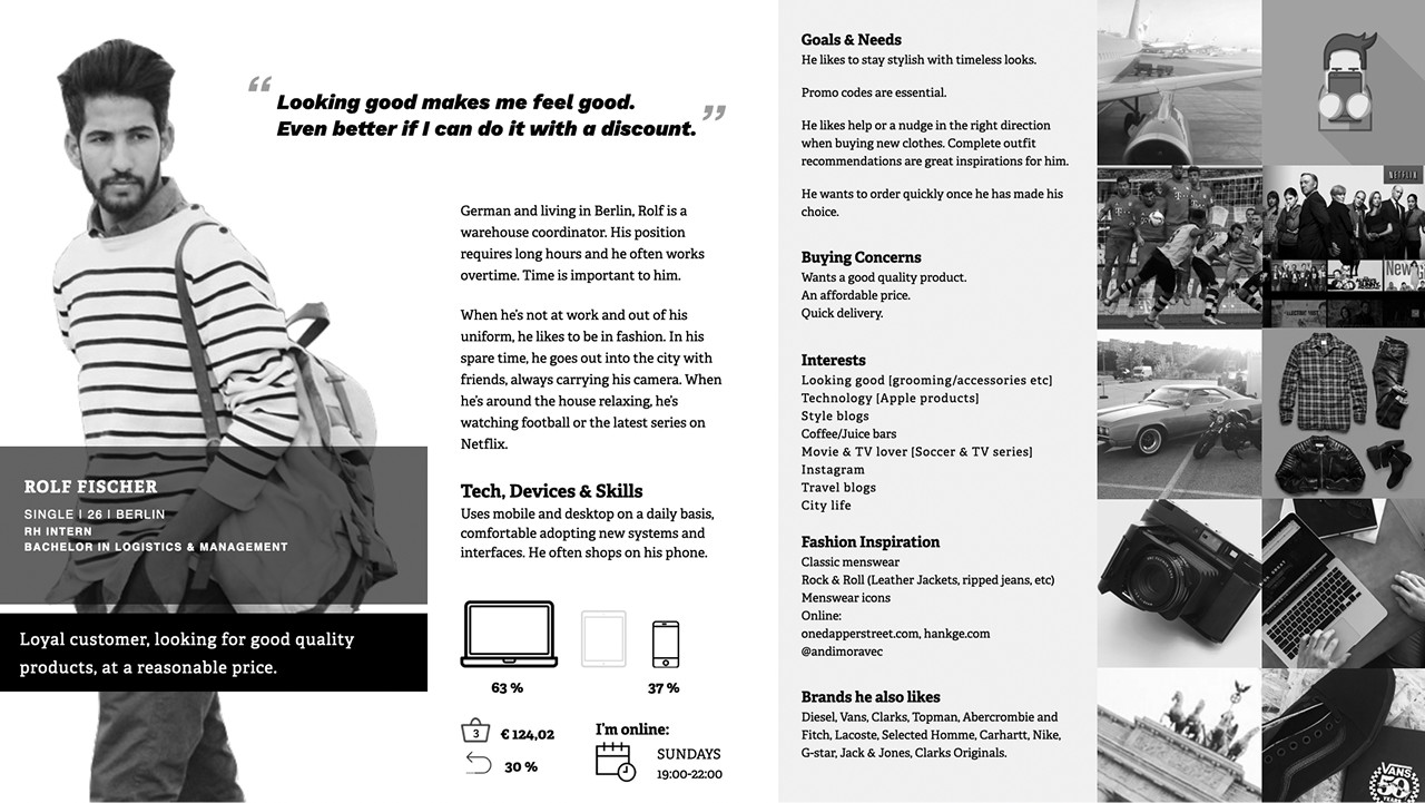
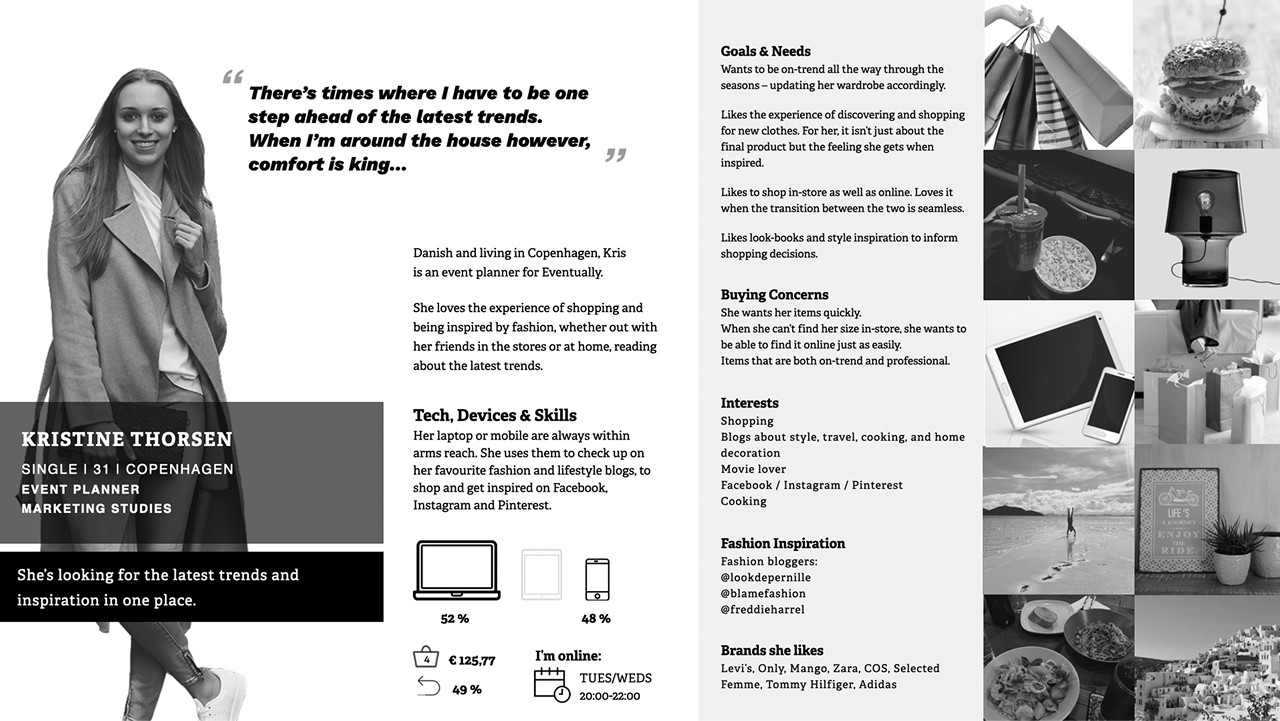
To validate our customer journey mapping, we prepared scenarios and used our data-informed personas, created previously, to recreate the most common journey path.
Outcome & issues found
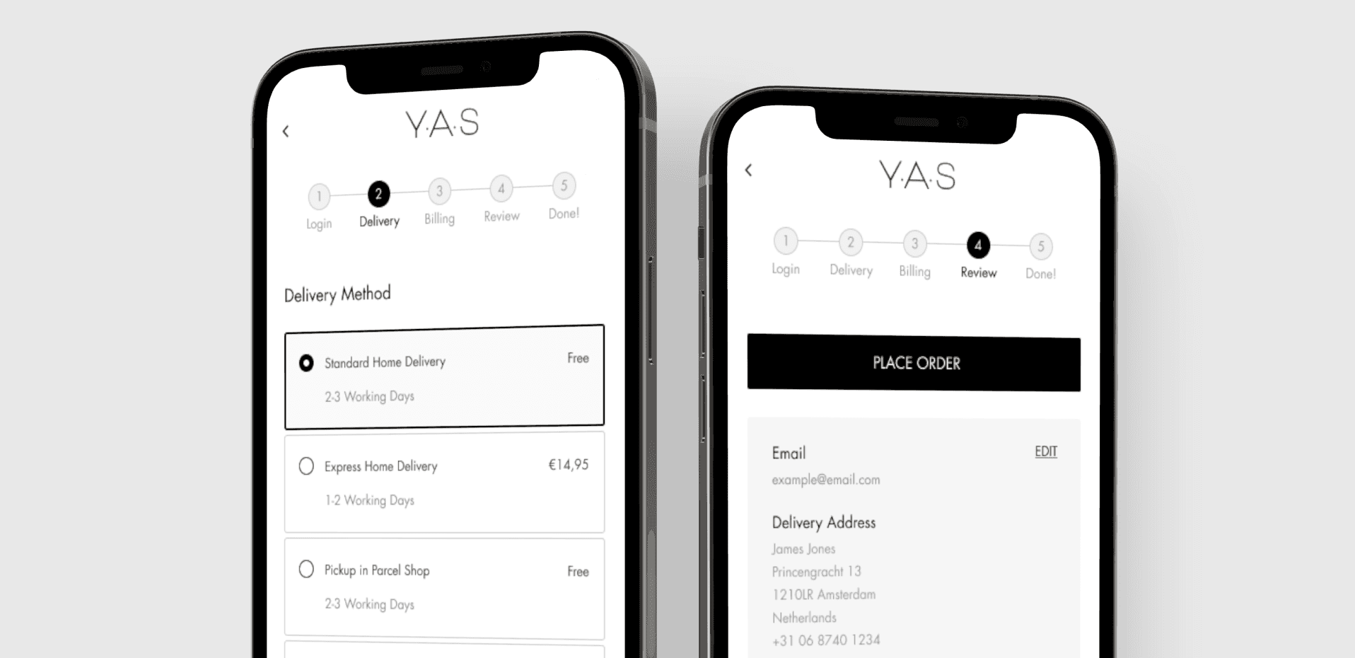
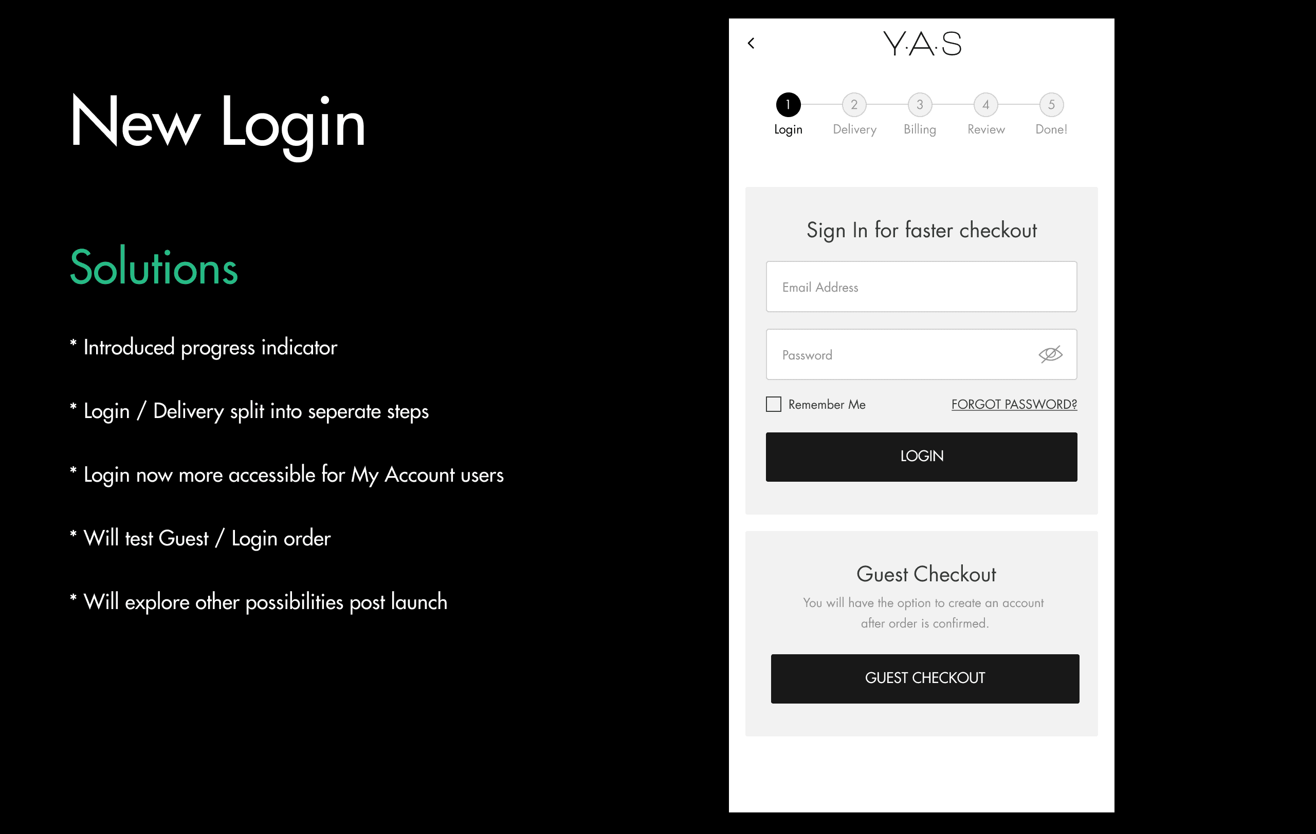
Login
• Login feature is not easily accessible
• Login and delivery step are merged and not always clear for users
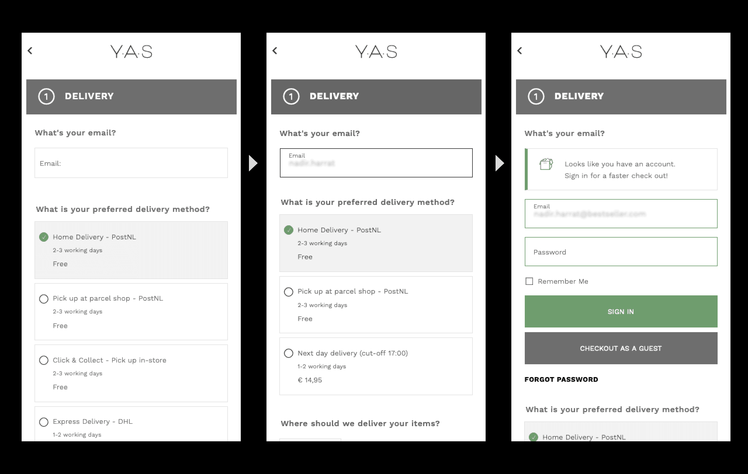
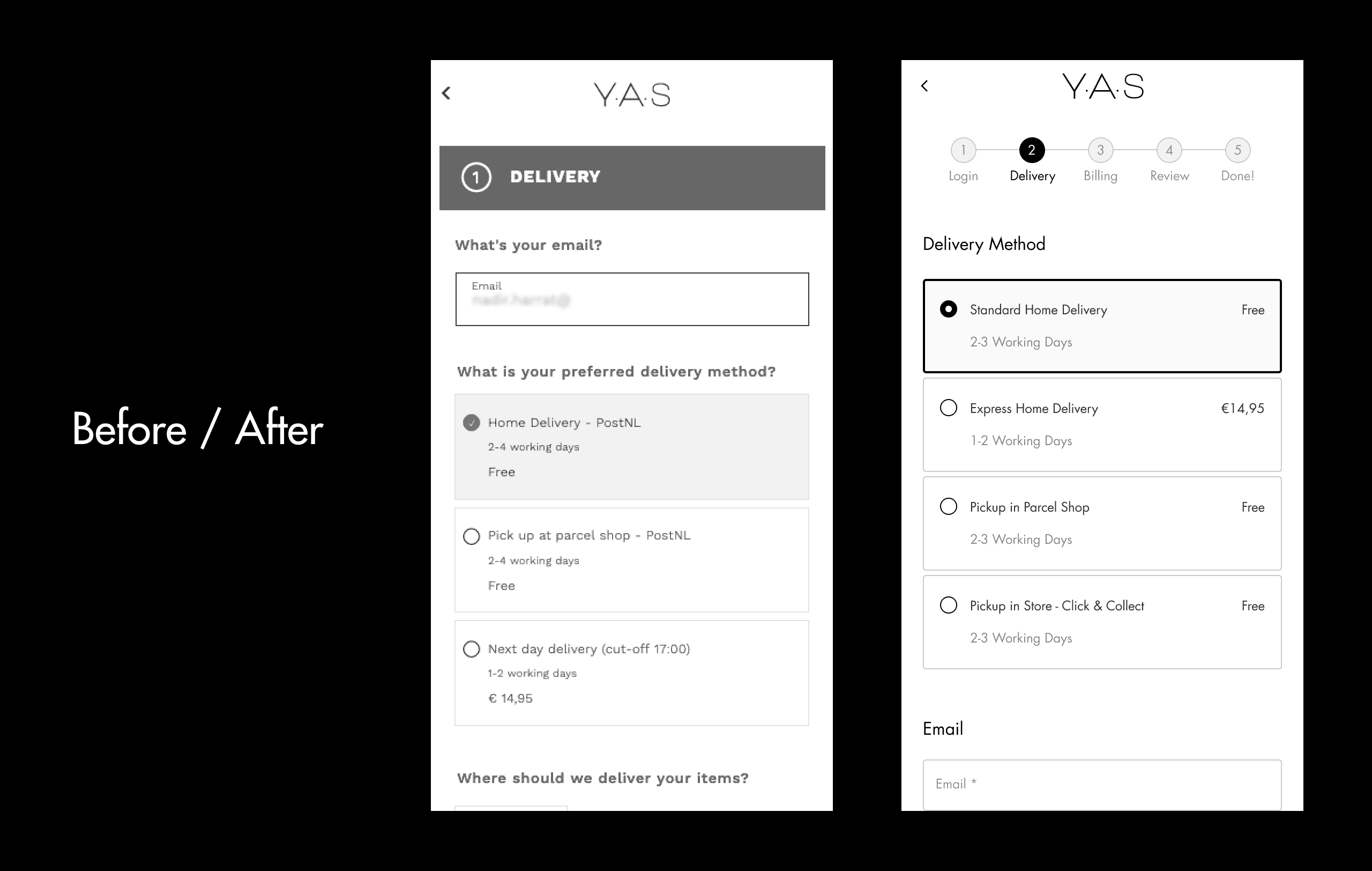
Delivery
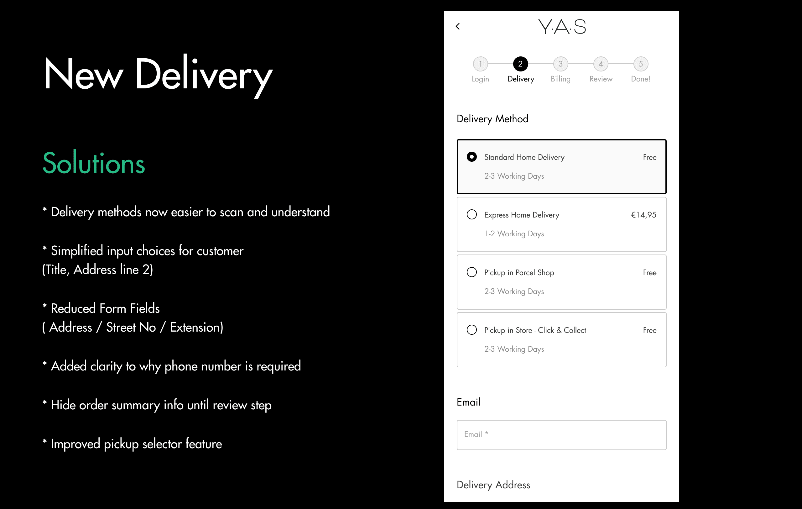
• Unclear indication of where the user is / how far to go
• Unclear copy in diverse elements (CTA included)
• Needless input fields
• Overwhelming elements after the CTA button
• Pickup location feature - selection is confusing
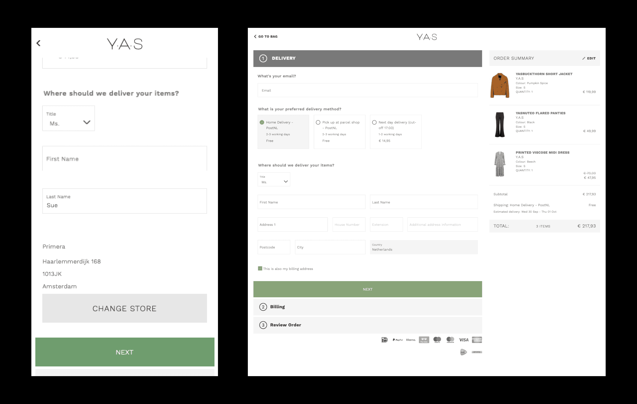
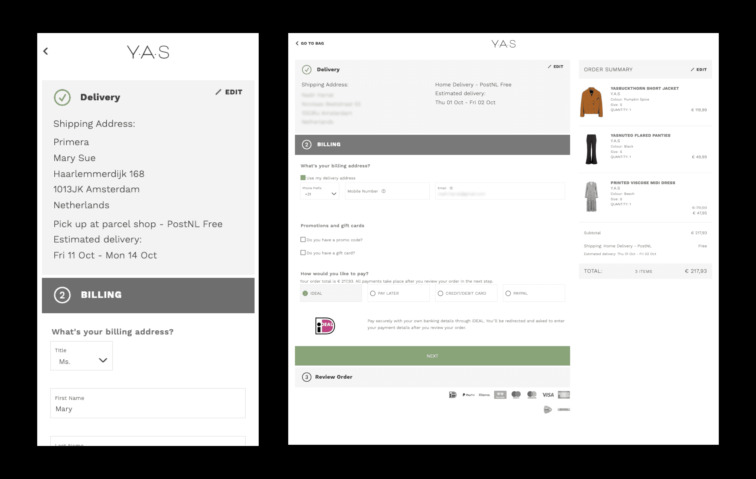
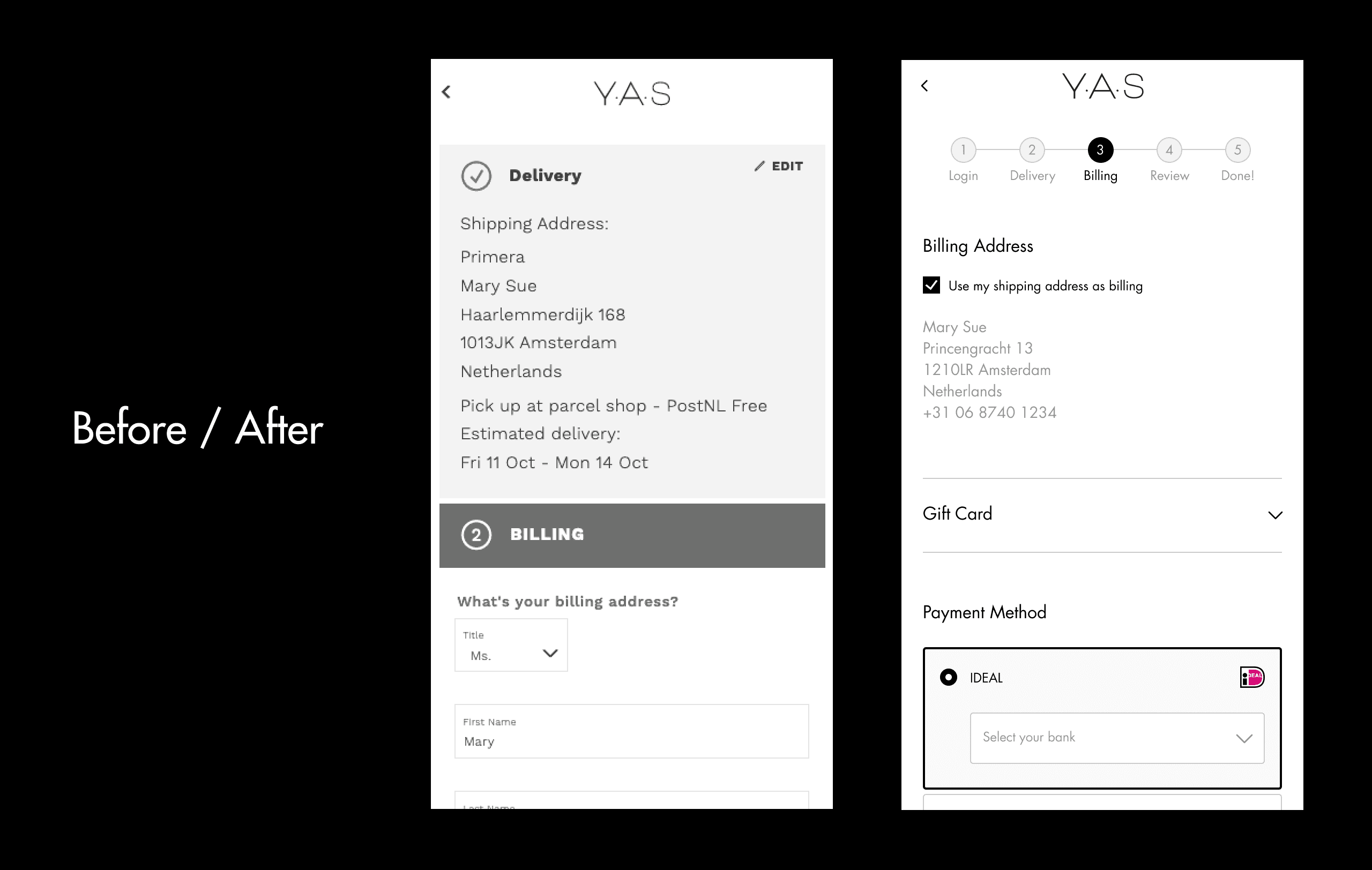
Billing
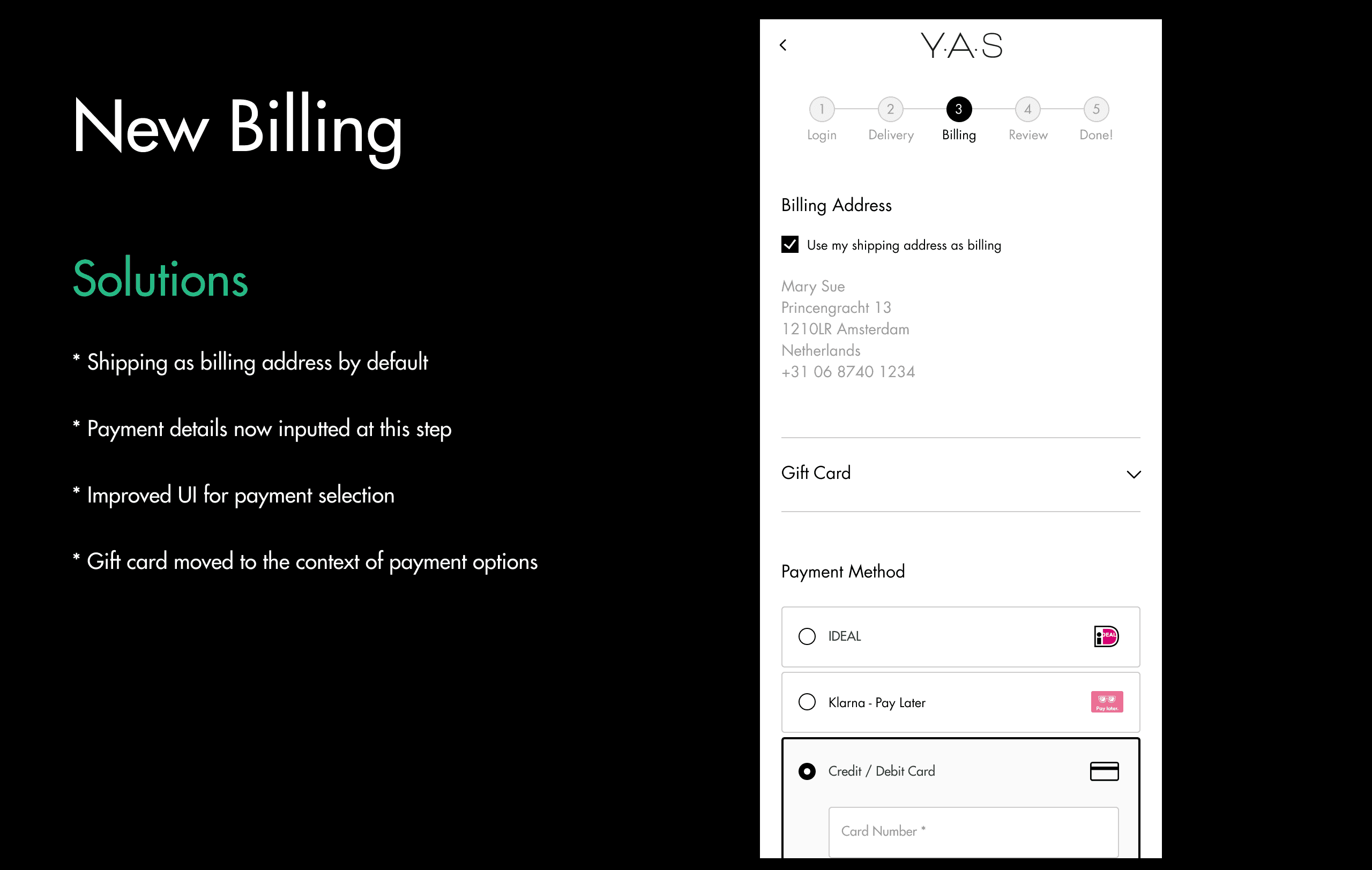
• Delivery info taking up most of screen
• “Shipping as Billing” checkbox on previous step
• Disconnection between payment selection and logo
• Payment details come in a separate step after the order review
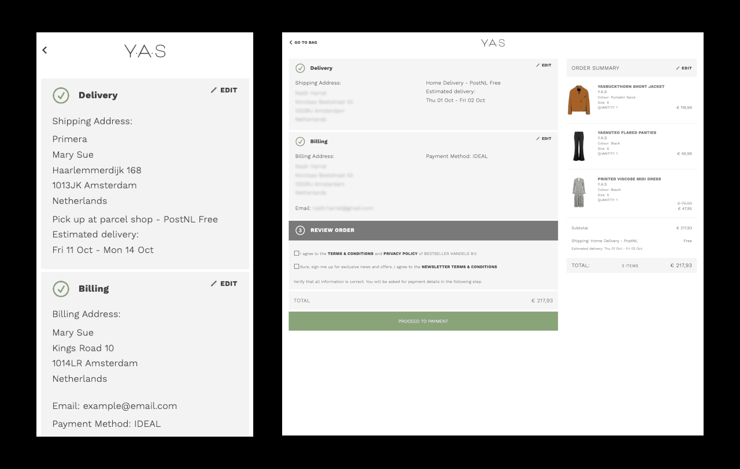
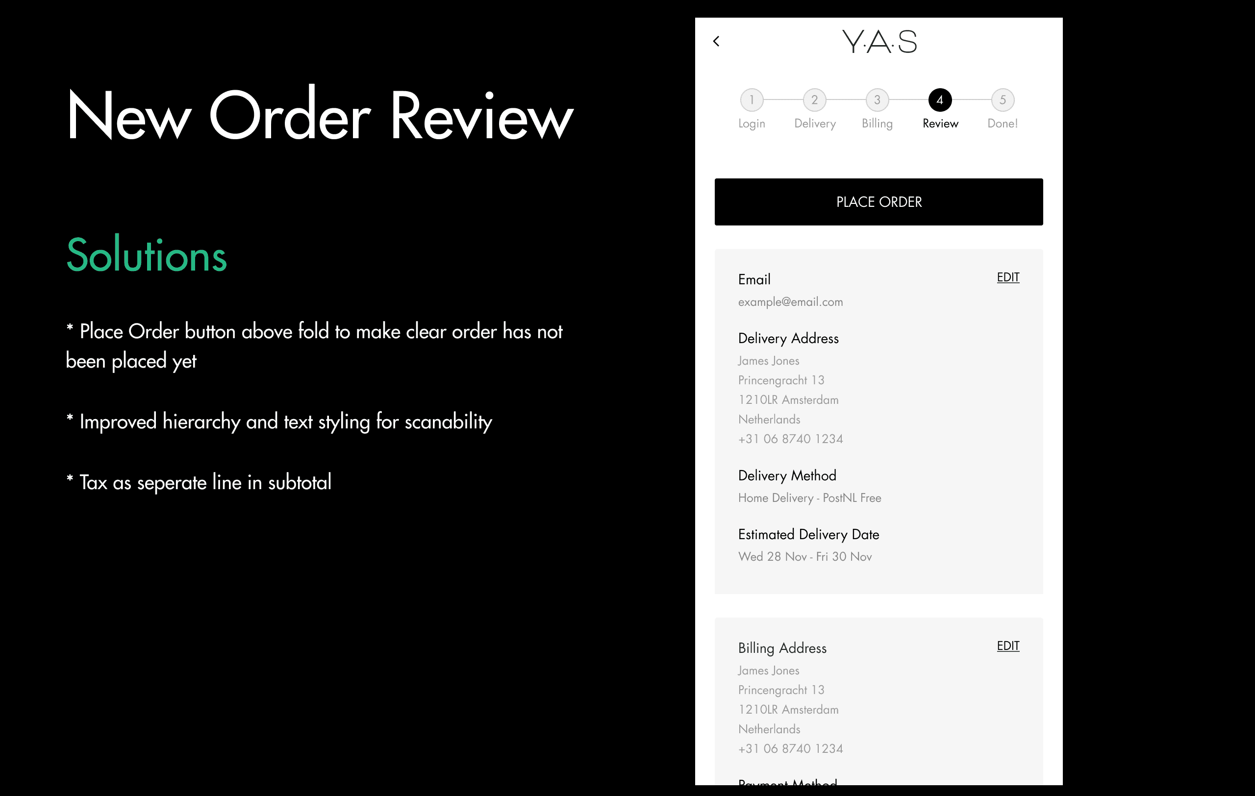
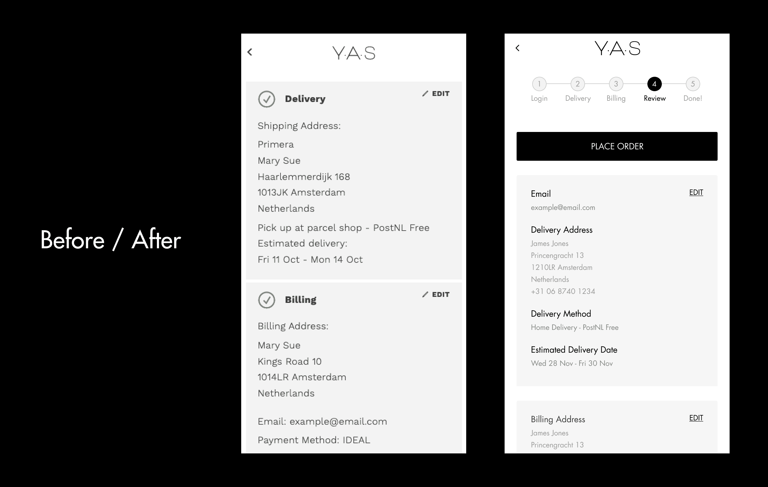
Order Review
• No text hierarchy to help scanning the content
• No indication that this is a verification step and the order is not complete
• Data revealed a high drop-off rate at this step
Order Confirmation
• Confusing hierarchy
• Low readability due to capitalization and text styles
Overall UI issues
• Brand styling is not consistent with rest of site
• Inconsistent hierarchy
• Low Readablility due to font size and colour
• Spacing alignment between forms / elements
The session provided the UX team with valuable material to focus on improvements and define priorities. The Customer Journey Mapping workshop was extremely valuable for both the UX team and stakeholders. By running through the different scenarios involving different stakeholders, we were able to identify critical pain points, uncover opportunities for improvement and align our goals with stakeholder expectations, ultimately leading to an efficient design process, with stakeholder buy-in.
The following steps
Based on the problems identified, the UX team researched and explored potential solutions, A/B tested some of them, prototyped and user tested the more complex ones, and delivered the final design solutions to be implemented. Key metrics were also defined to monitor and evaluate the performance of the new experience.
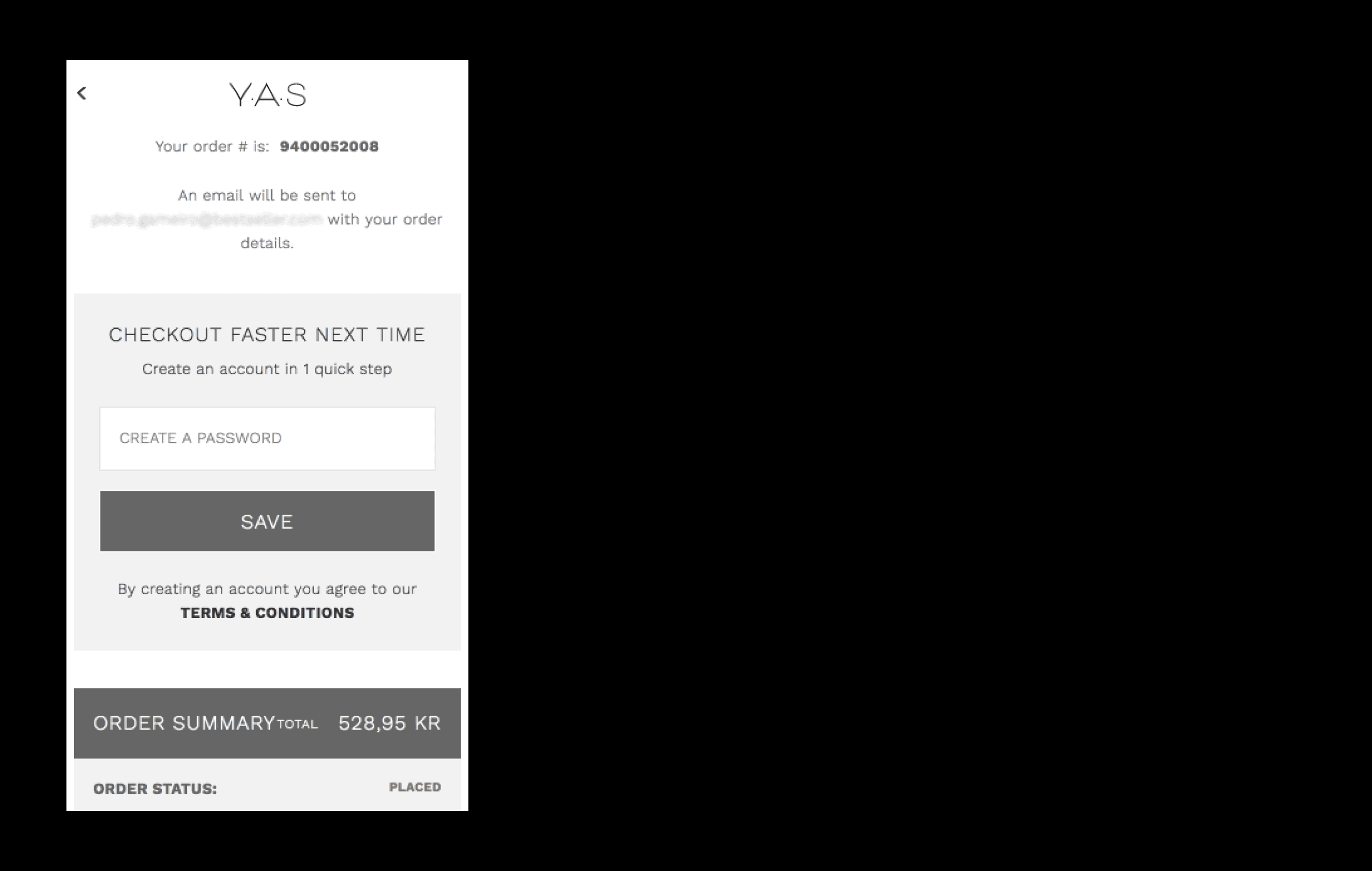
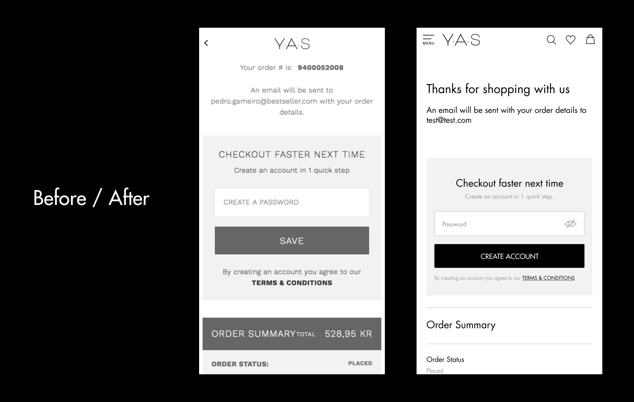
Before / After - Mobile version
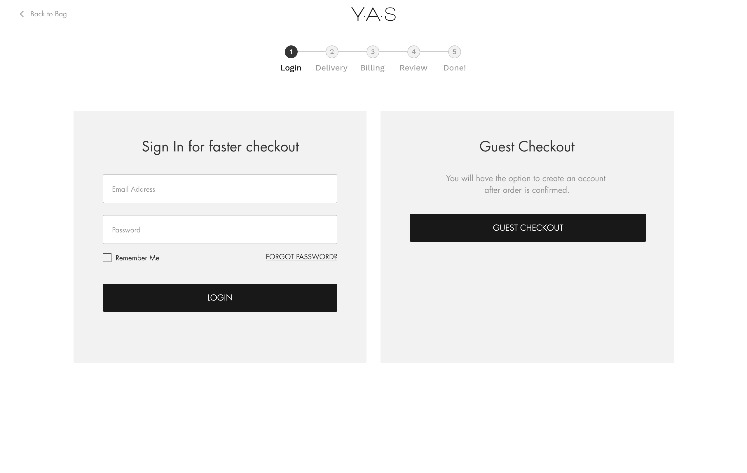
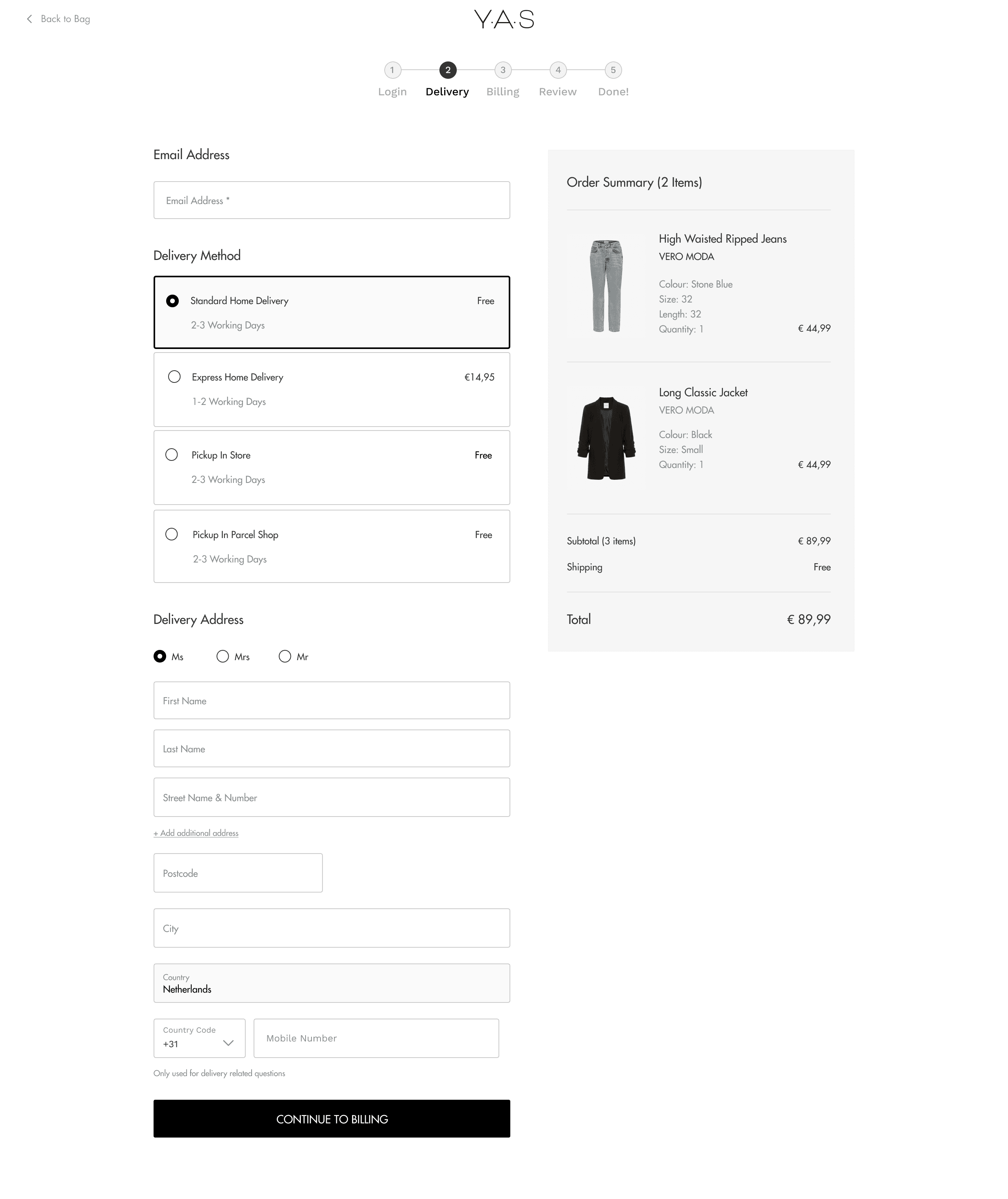
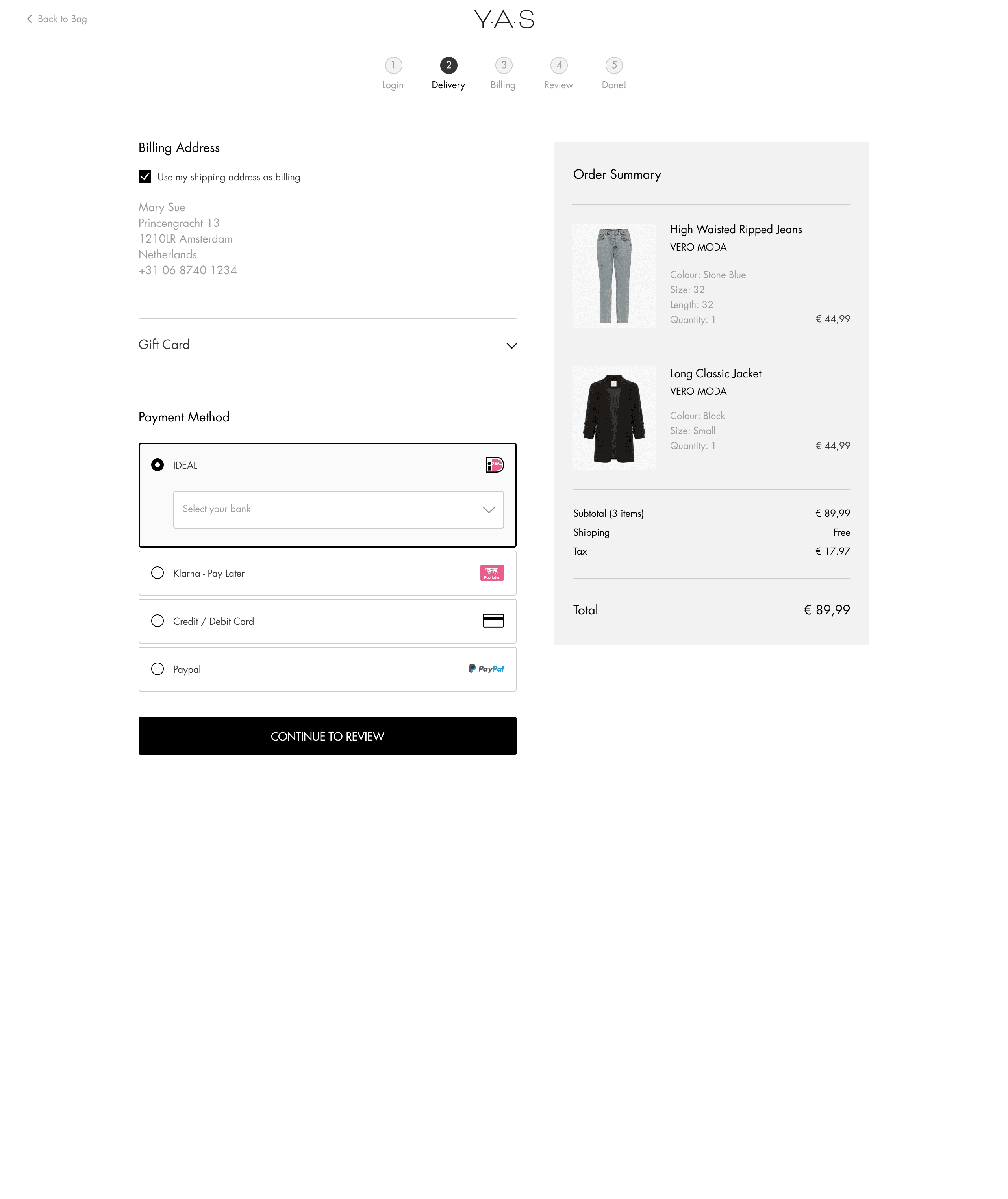
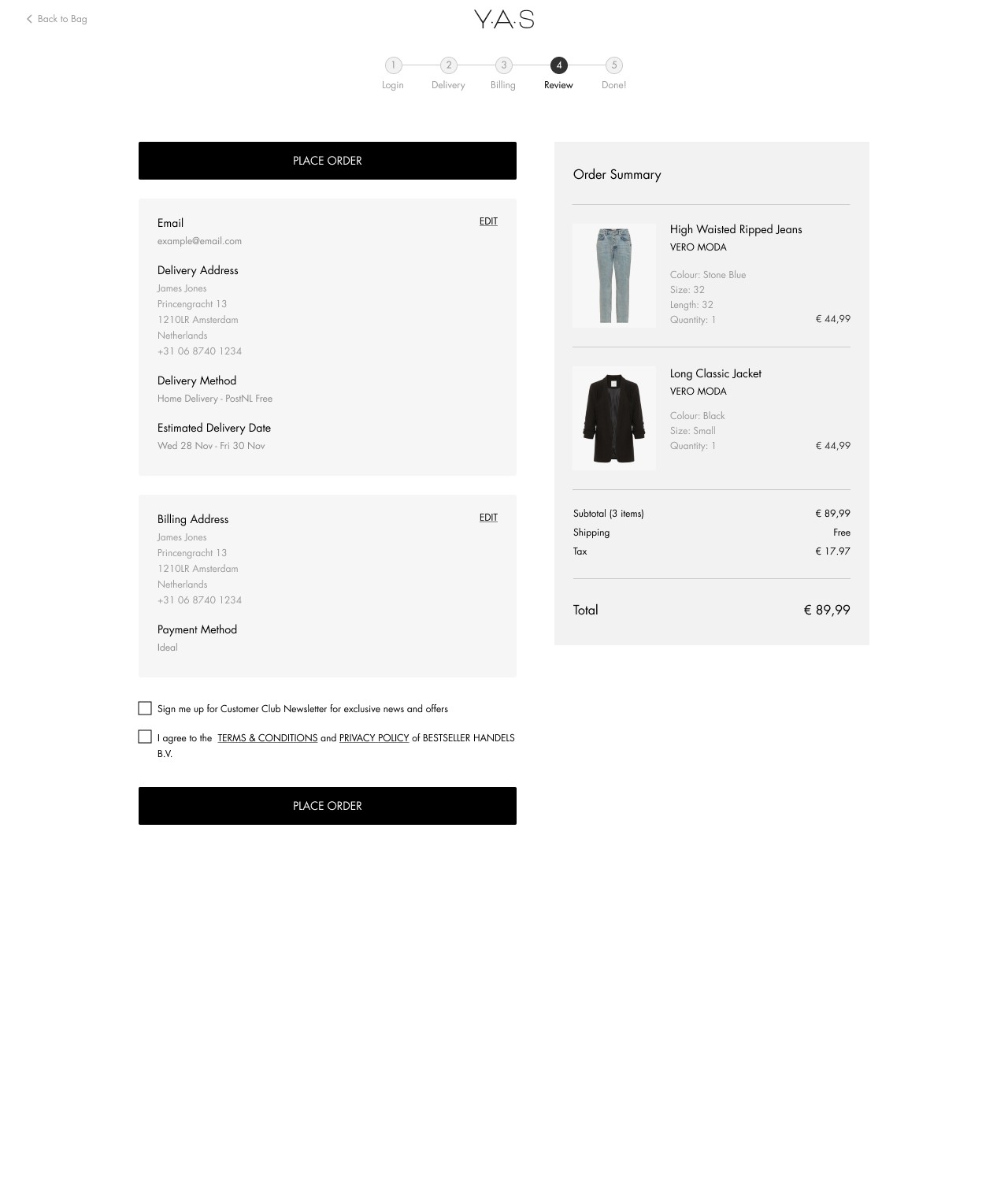
Desktop - Final version
Impact
Cart abandonment rate decreased
by
-12%
Checkout abandonment decreased by